MyPetER
Healthcare
·
Web & Mobile
UI/UX
Lo-fi & Hi-fi Prototyping
Interaction Design
Overview
My Pet ER was born out of a deep love for our furry companions. After their beloved Lenny was struck by a car, Michael and Amy faced significant challenges finding emergency pet care. Motivated by their experience, they developed an innovative app to help pet owners quickly connect with veterinary clinics in emergencies.
The app aims to provide timely support and assistance, ensuring that pet owners can access the care their furry friends need during critical moments. We can share all pet details before even arriving to the clinic, so the vet will have all the neccessary information beforehand.
The Constraints
This project was an MVP with a tight timeline of 8 weeks. This approach allowed us to quickly bring the product to market with the minimal necessities, ensuring that we could gather real, useful data from early users. By focusing on core functionalities, we were able to launch efficiently and iteratively improve the product based on user feedback and real-world insights.
Who is this for?
Pet Owners
In a crisis, they need quick, reliable access to the right vet care, without wasting time searching or calling around.
Vet Clinics
Looking to support urgent cases. Many of them want to be able to support and manage emergency cases but don’t always have a clear, direct way to connect with those in need.
Key Objectives
Working closely with the client, we nailed down three main goals for the project. These were essential to making sure the MVP would hit the mark for both patients and practitioners—while still being realistic to launch in just 8 weeks.
Make emergency care accessible
Reduce stress in emergencies
Support veterinary clinics
Concept Screens to Low Fidelity
I kicked things off by sketching out some early ideas for the key screens—just to get the ball rolling. We then ran a workshop to see if we were heading in the right direction, and thankfully, it confirmed we were on the right track.
However, something about the screens didn’t sit right with me. They looked fine, but they didn’t feel right for emergency situations. So I quickly mocked up a prototype focused on the emergency flow and had a few people test it—coworkers, friends, and family.
It was tough to fully simulate the stress of a real emergency, but one pattern stood out: the time it took to interact with the app varied based on hand size.
The issue? Reachability. Critical actions were too high on the screen.


In an emergency, every second counts. So I repositioned that section lower, within easy reach of the user’s thumb. That small shift made a big impact. Users could act faster, with less friction, even if they were panicked or holding their pet with one hand.


Pet Details Screen


Vet's home screen
High Fidelity
In the hi-fi phase, we worked with the existing brand palette, centered around a calm, trustworthy shade of blue, ideal for a healthcare setting. We used the Manrope typeface for its clean, modern feel and strong readability across devices. For icons, we chose Feather for their clarity and simplicity, they’re lightweight, easy to scan, and kept the interface feeling open and approachable. Our in-house logo designer also refreshed the original logo, giving it a more refined look that aligned with the overall design direction.


Pet Owner Home Screen


I designed the home screen to adapt based on the user’s context:
Guest View – Without needing to sign up, users can instantly see nearby vets and clinic details. This lowers the barrier to entry, especially in urgent situations.
Default View – Once logged in, users see a personalised dashboard showing their pets, quick actions, and a list of nearby clinics, making it easy to manage care day-to-day.
Emergency View – When there’s an active emergency, the interface shifts to highlight a large red banner at the top of the screen. This provides fast access to critical details, helping users act quickly when it matters most.
Emergency Flow


In just a few taps, users can select their emergency type, add extra details if they have time, and choose the nearest vet clinic. The first two steps are skippable to speed things up—vets will follow up with a call to gather more info if needed. Every second counts, so the flow is designed for speed, clarity, and minimal friction.
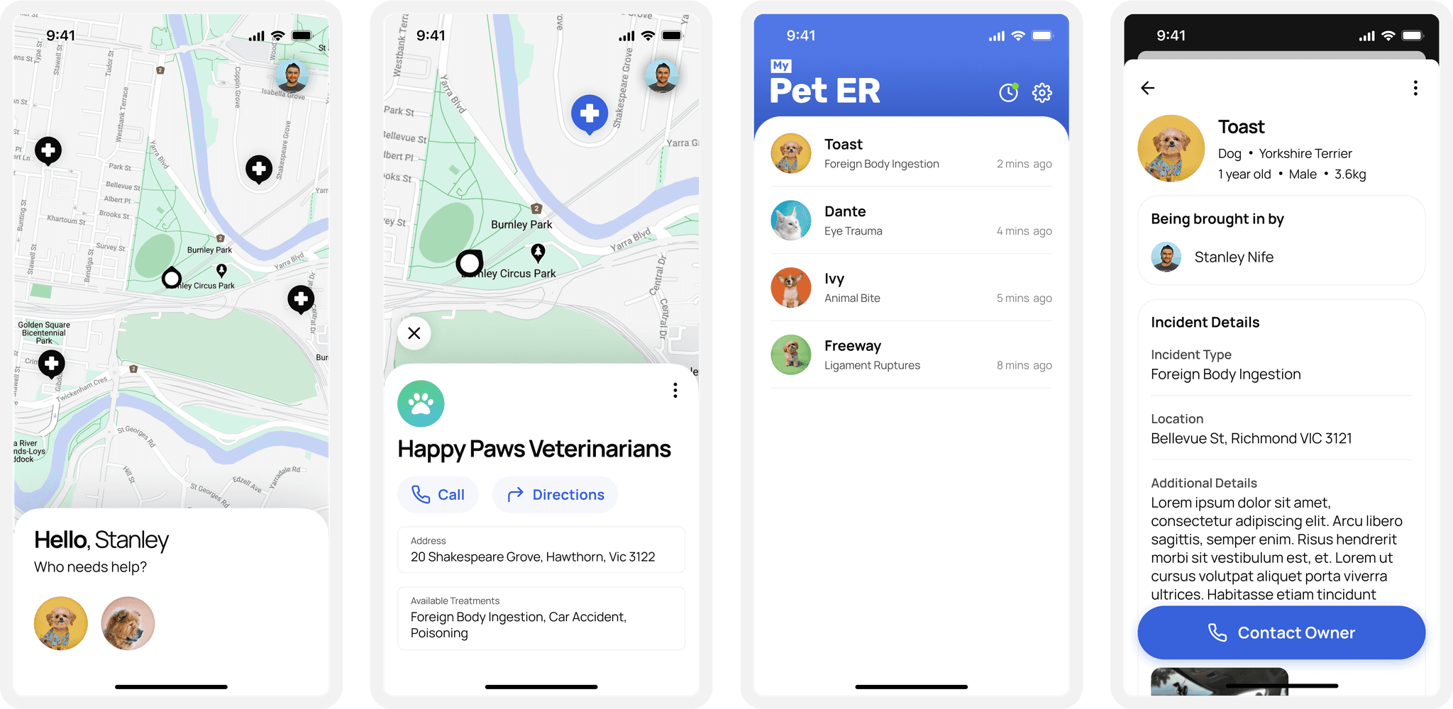
Vet Home Screen


On the vet side of the platform, we designed a clean and focused home screen to give clinics a quick overview of incoming pets. This included key info like condition type, urgency, and estimated arrival time—helping vets prepare in advance and triage more effectively.
The pet details screen allowed vets to dive deeper into each case. One important feature here was a prominently placed contact button, making it easy to reach out to pet owners if more info was needed before they arrived. Speed and clarity were crucial here, especially in emergency situations.
As we continued testing and gathering feedback from vets, we added a couple of features that hadn’t been in the original scope. While we already had a way for clinics to set their availability (a commonly requested feature), vets also asked for two important additions: a way to input current wait times, and the ability to adjust operating hours on the fly. These updates allowed the system to more accurately match pet owners with nearby clinics based not just on availability, but on actual capacity in the moment—helping improve the experience on both ends.
Handoff
Once the designs were finalized, I collaborated closely with the development and product management teams to ensure a smooth handoff. We walked through key flows together, clarified interactions, and addressed edge cases early. I provided well-organized Figma files with detailed specs, components, and annotations.
Throughout the build, we ran constant quality checks, reviewing in-progress work against the designs to catch inconsistencies and polish the user experience. These regular syncs helped keep everything aligned and ensured the final product stayed true to the original vision.
Whats Next?
We’re now looking to integrate the app with the existing pet management systems used by vets, so everything works seamlessly in one place.
We're also continuing to gather and review feedback from both vets and pet owners to guide future updates. The goal is to keep improving the experience on both sides of the app—making it faster, smarter, and even more helpful in those critical moments.